My love affair with food photography started much longer ago than my portfolio represents, but it wasn’t until about 5 years ago that I really started learning the techniques and skills behind what it takes to be a good food photographer. I am nowhere near the end of my journey and that’s something I really love about this kind of art- there is SO much to know about styling food and each type of food requires a different kind of eye, knowledge and creativity. However, there is one thing you can almost always count on- the angle of your camera in relationship to your subject. There are three main angles that are most commonly used in food photography and each angle has a specific goal. Check it out!
Angle One: Top Down.
This angle has become really popular in recent years and is probably my favorite angle right now. The top down approach allows you to tell a whole story through a crafted scene and to direct the eye around the entire image. By using elements of geometry, symmetry, pattern repetition, movement and the rule of thirds you can create a scene that is pleasing to the viewer in respect to the universal visual elements that have been found to be the most appealing. Find examples below followed by a description of the main components I was utilizing in each!
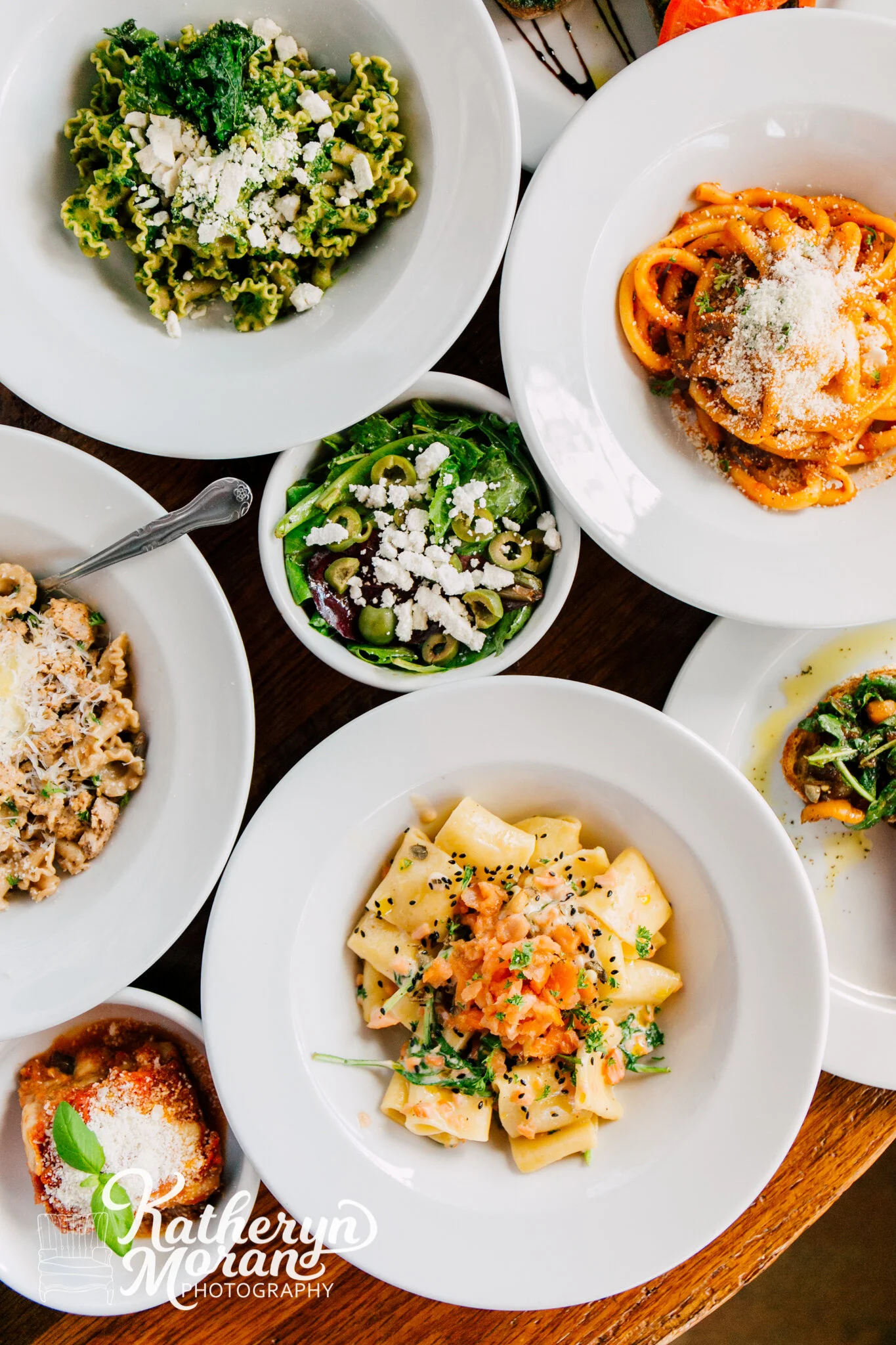
In this image I wanted to create a full table showing off all the different pastas this Seattle restaurant (Due Cucina Italiana) had to offer. By using pattern repetition in the circle bowls it creates an appealing scene to the eye. I used implied movement here with the placement of the bowls in a cascading type pattern and the single fork to the left of the frame pointing inward and upward to keep the flow of your eye moving.
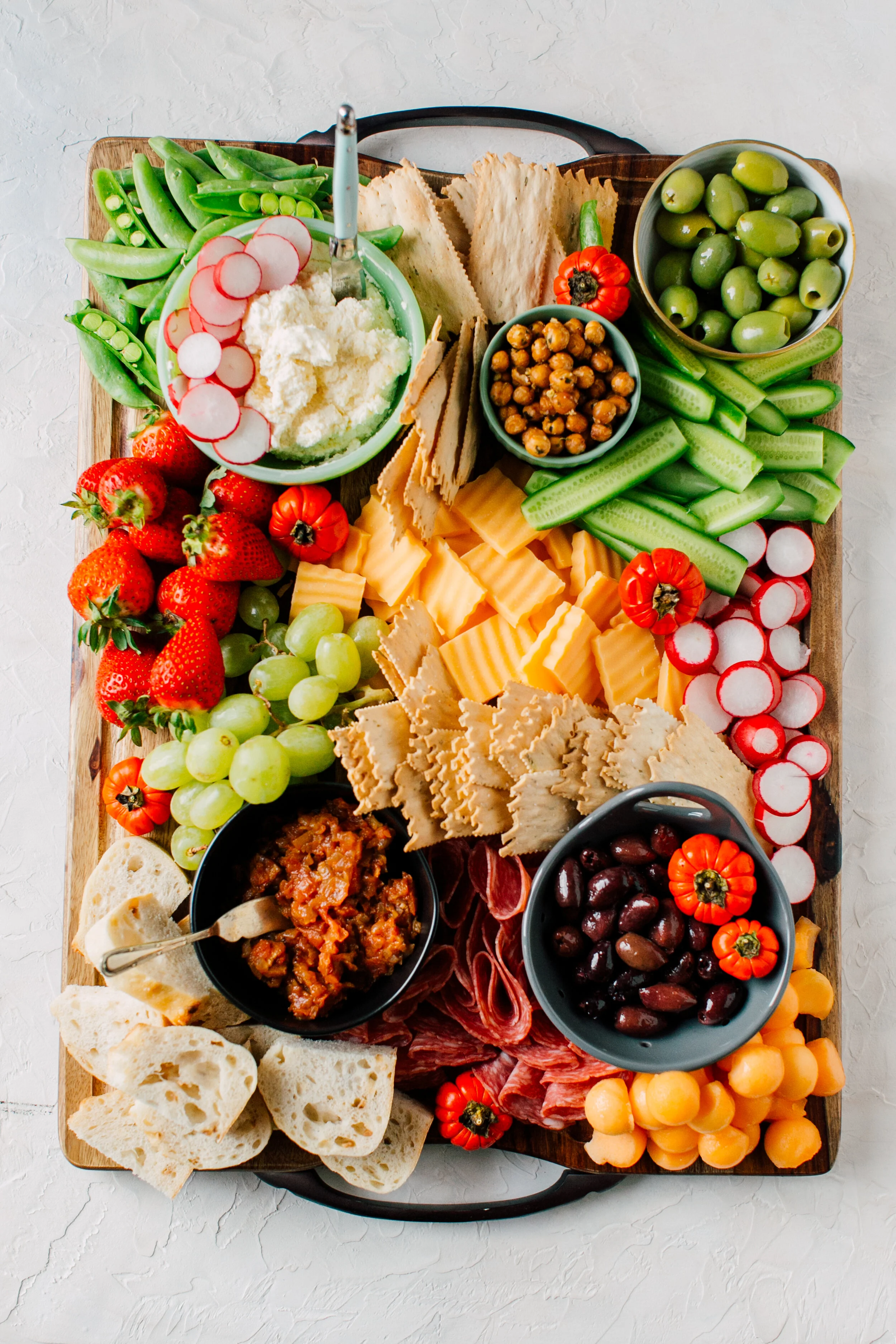
In the top down shot of this bright and colorful charcuterie board I wanted to show abundance. I used pattern repetition once again to draw your eye throughout the entire board with the different sized circles and purposefully placed the food items all facing in towards the middle of the board. I also created additional framing inside my frame by having the entire shape of the rectangle board contain my subject.
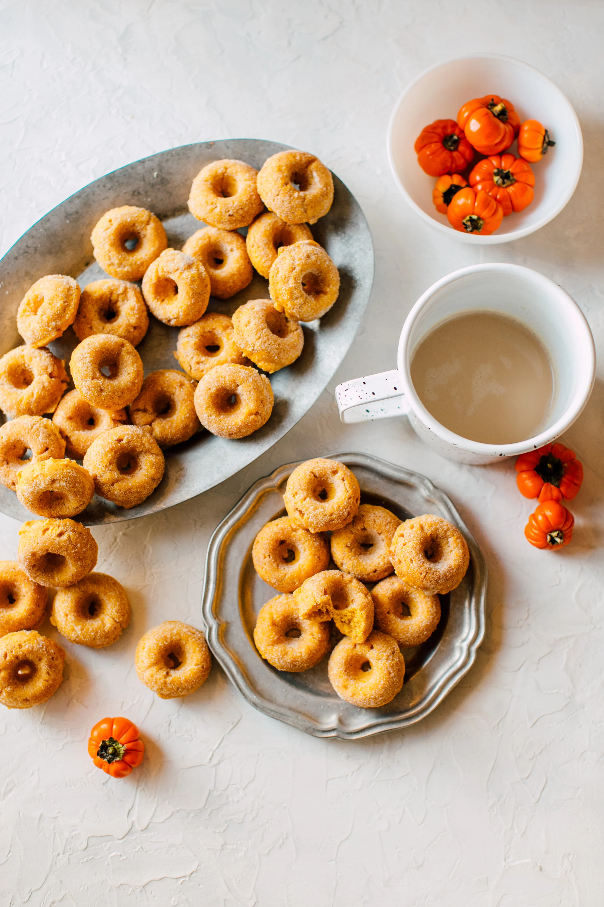
This little mini pumpkin donut bite photo is FULL of pattern repetition. There are SO many circles in this photo from the donuts to the plate and the coffee cup. You can see that I strategically placed the donuts to the left to come down and meet the plated donuts and your eye is naturally drawn from the top of the scene to the bottom and back.
Angle Two: 45 Degree.
The 45 degree angle is perfect for showing depth and for highlighting a specific subject or a particular element of your subject. You can still tell a bigger story with this angle by compacting your background props and making the foreground focused specifically on the part of your subject that’s most important. It can be challenging to really get the perfect 45 degree shot, but when you really get it right the photo will instantly come together. Be patient and try, try again!
In this image I wanted to show off the depth and fluffiness of this delicious peanut butter blossom. It was important for me that the cracked texture of the cookie and the shiny, almost melted texture of the Hershey kiss both come through in the image. In order to get all of these elements, I found the 45 degree angle to be the best approach. You can still see the story of my kitchen setup with the baking sheet, sugar for rolling and extra kisses!
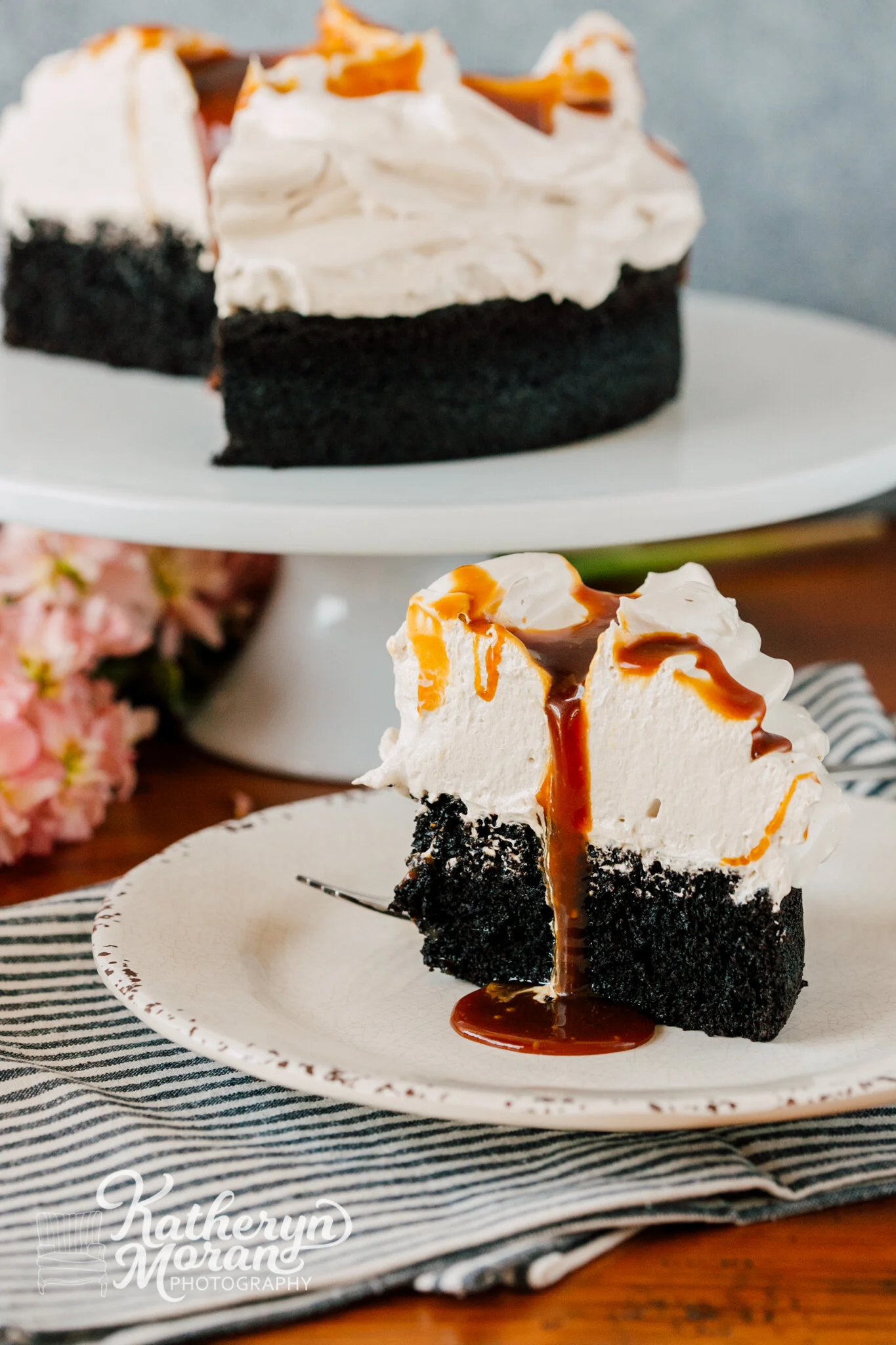
The story here is all about this absolutely scrumptious dark chocolate cake with earl grey chiffon and sea salt caramel from Antler Baking Co. The height of this cake and chiffon alone were reason enough to cut this baby open and make one single piece the star of the show. From here I was able to highlight the moist cake, fluffy chiffon and beautiful caramel drizzle!
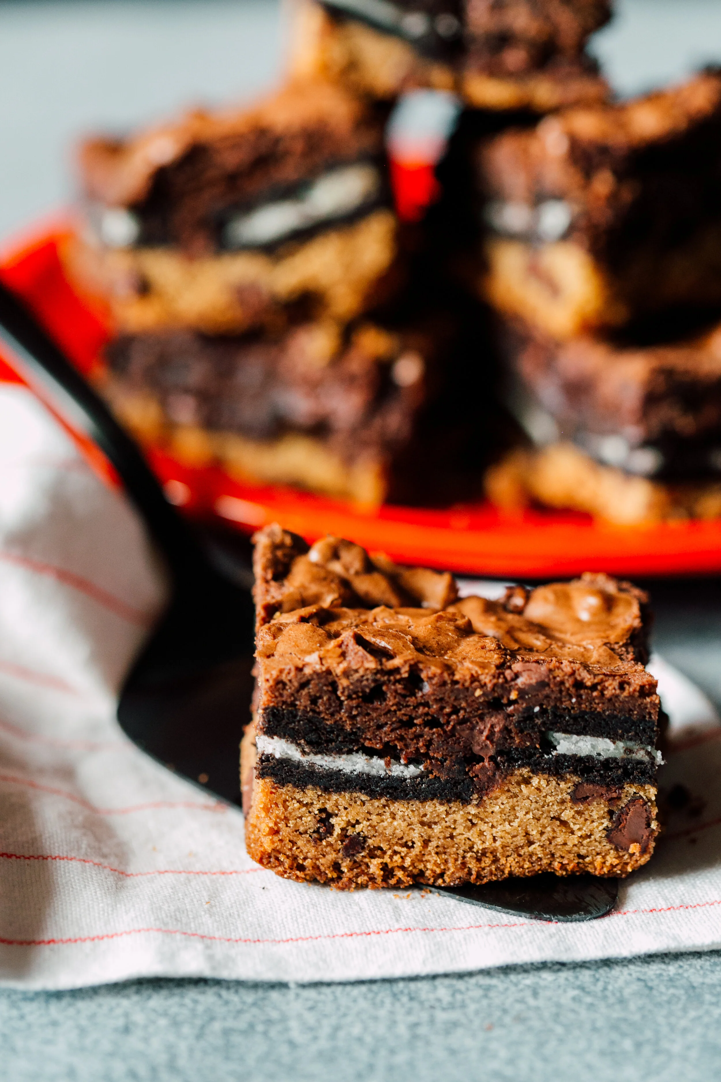
Finally, Slutty Brownies. These triple layer masterpieces have so many different textures I wanted to show off. From the blonde brownie bottom and the Oreo middle to the dark chocolate top layer- it’s all important in this recipe. Again you can tell the story of the giant pile of brownies behind and the spatula leading your eye backwards!
Angle Three: Straight On.
The straight on angle is best for situations where you want to show layers OR specific movement like splashes, drizzles, dustings, etc. It works great for foods that stack such as pancakes or when you need to show the inside of a subject.
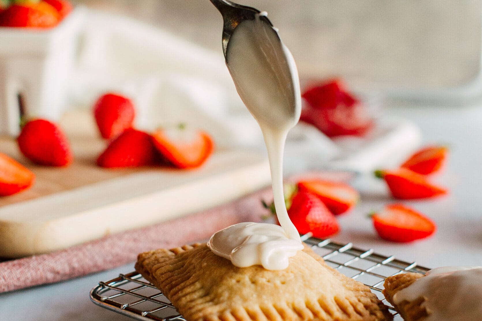
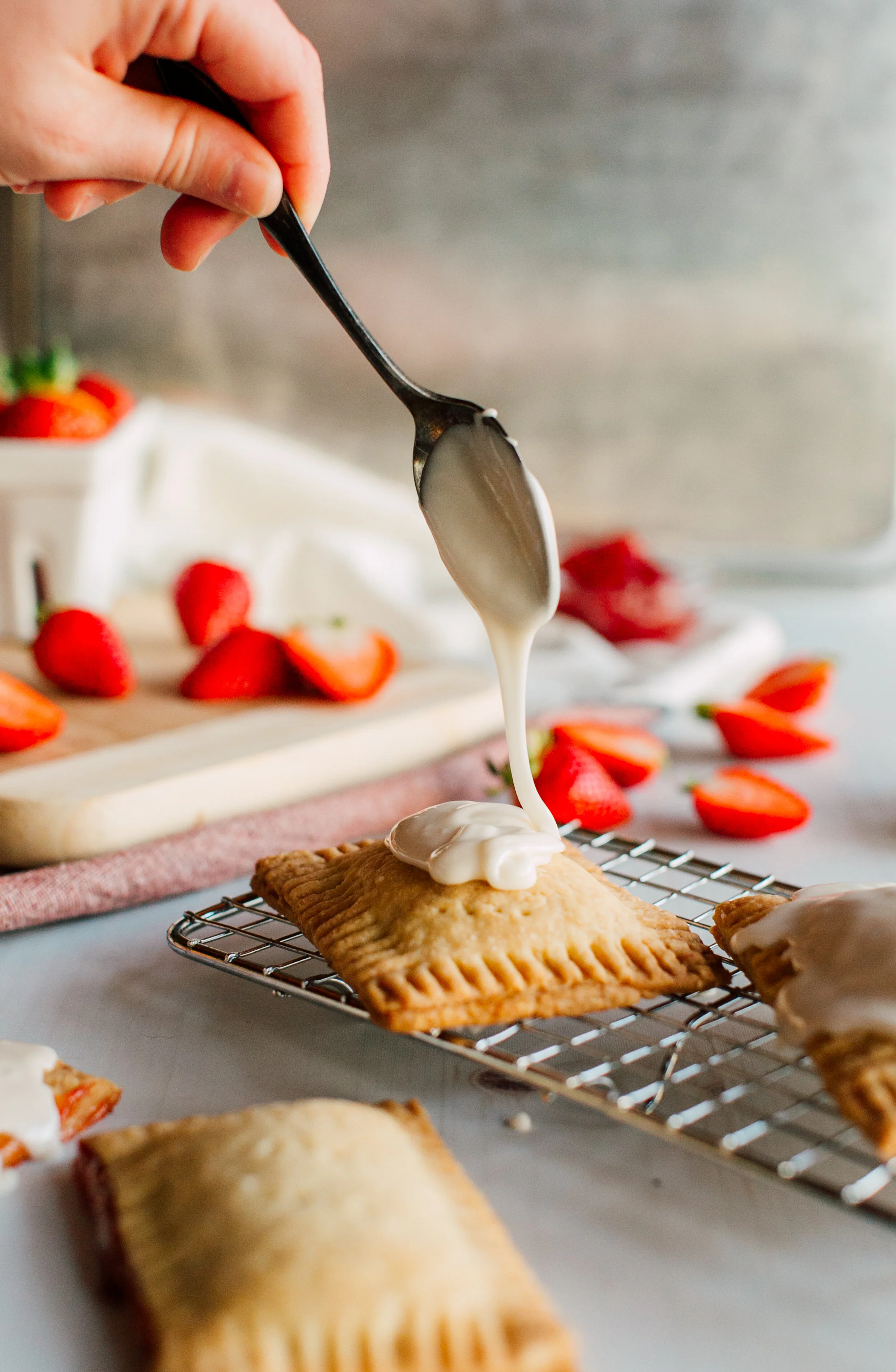
Strawberry pop tarts! These homemade tarts wouldn’t have been complete without a healthy drizzle. This straight on angle is sure to highlight the action of drizzling and bring you right into that moment in the kitchen when the sugar hits the subject!
This stack of chocolate pumpkin brownies gives you a good idea of how thick and dense they are, allows you to see the colors of the swirls throughout the subject and really demands all your attention dead center in the photo.
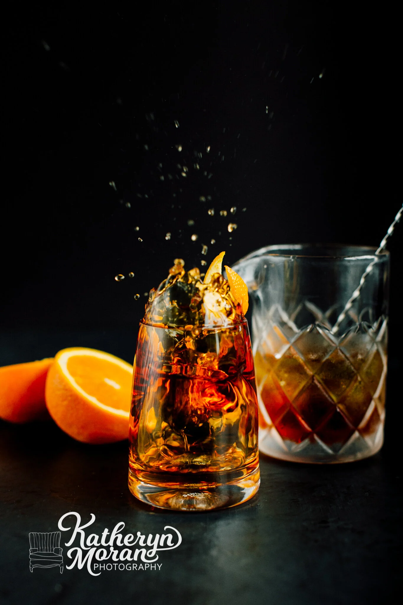
Another fantastic example of capturing movement with this whiskey drink from Galloway’s Cocktail Bar. Particularly when shooting splash scenes it’s SO important to be eye level with your subject in order to fully capture the entire splash. Pro Tip: Be sure your shutter speed is high enough AND you have enough light to capture moving pieces!
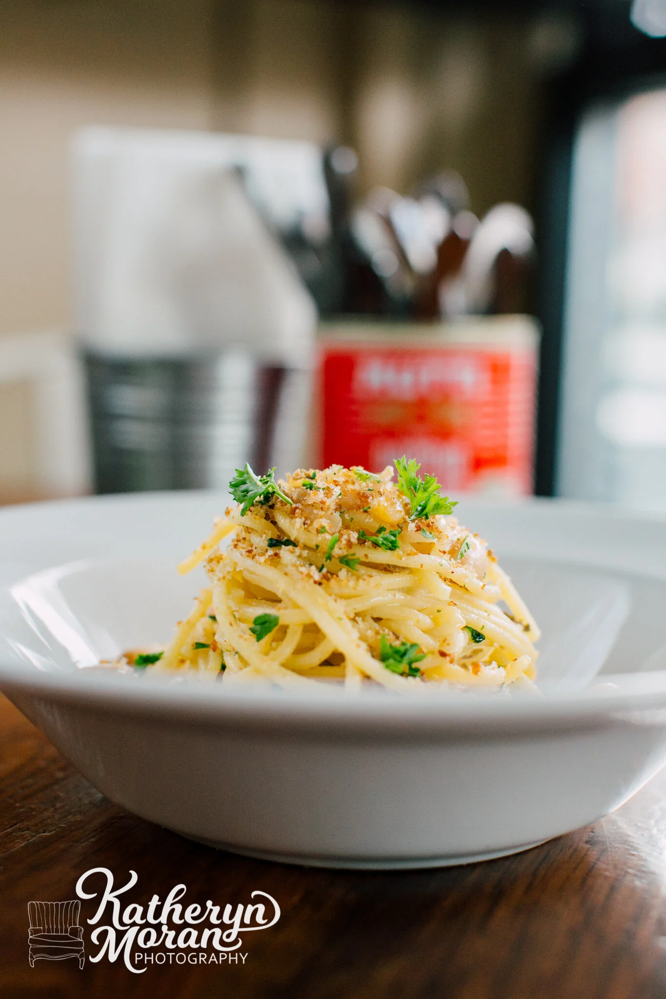
I had to end with one more shot of this delicious pasta from Due Cucina Italiana. I chose to shoot this dish backlit and from the straight on angle so that you could really see all the fabulous layers of yummy noodles and the delicate sprinkles on top. This was a perfect way to show and appreciate the texture of their house made pasta!
HAVE FUN!
Food photography is all about trying new angles, light and fun props. Hopefully these tips will give you a little jumping off point!
